Experience Manager TV - Case Study
We had developed Experience Manager (EXM) as a robust content management system for use by various Hospitality clients (Disney, Carnival Cruises, Hotel/DIRECTV) to help wrangle the huge quantity of videos, services and info available to guests. As we uncovered more powerful ways to control the content with our system behind the screen, we also found a need to help our customers DISPLAY their content more effectively. I took up this project of designing the Guest facing UI with the intent of providing a few template updates… but soon realized it required MUCH more attention! Eventually I designed nearly a dozen diverse display styles (and multiple sub-pages) to be applied across the different clients to help retain the uniqueness of each brand. The updated EXM TV experience resulted in an 84% growth in guest usage which translated to massive increases for on-site services and products!
Adobe Creative Suite, Sketch, Omnigraffle
Lead Designer, UX/UI Design, Prototypes, Research, Strategy, Copywriting, Client Relations

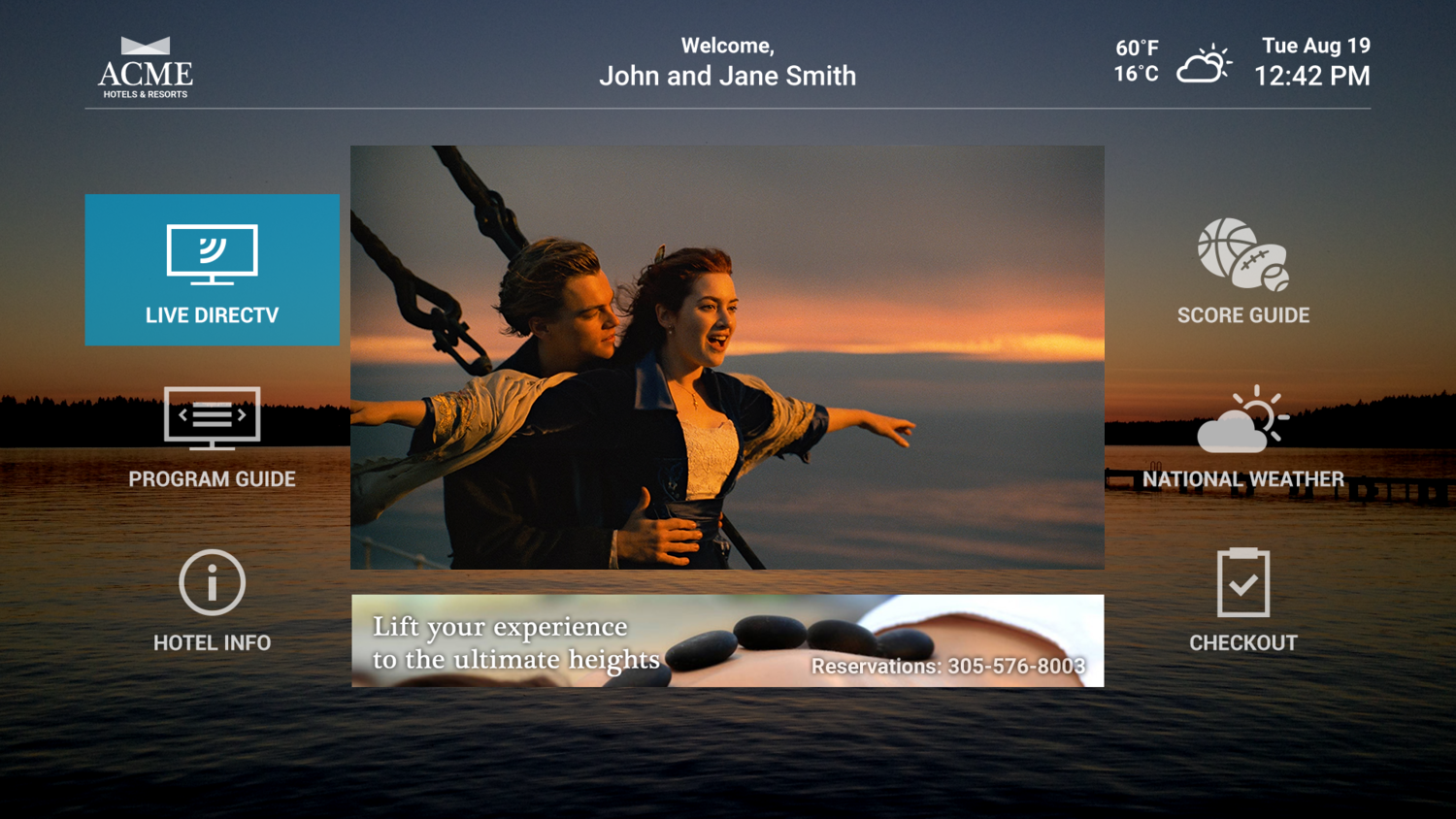
The Standard Display Screen
No matter how powerful our behind-the-screen CMS was, I found most guest-facing hospitality screens looked like static images or old PC command-line nightmares! Piles of white text on a dark background with mysterious terminology that left a guest guessing at the outcome of any interaction. Considering the vast amount of possible content and services I knew was available, this needed to be remedied!

Investigation & Discovery
The initial customers included Princess Cruises (Carnival sub-brand), DirecTV (multiple hotel chains), and Disney. After a period of discovery and analysis, I also recognized that each vertical/client had a specific set of priority content for guests and devices beyond what had been previously discussed. These variations would require even more diverse designs to help surface that content in both landscape AND portrait display options. To address this, I created flexible design systems that could adapt to different environments without sacrificing usability or visual consistency.

Personas and User Stories
The wide assortment of content and display targets required creation of a massive amount of personas and user stories to cover all the options. I helped determine priority content and when/where it could be displayed based on the client goals. I also had a broad spectrum of display and technology frameworks to consider in parallel with the personas and user stories. I created a “technology persona guide” that helped the team recognize limitations and advantages of each platform. This guide became an essential reference during design and development, keeping everyone aligned on what was possible across different setups.

Mind Maps
Once all the information was collected, I attacked the whiteboard with lots of markers… and erasers! The goal here was not to make a flow chart or definition of how a user will move across information - but rather to organize the content and define hierarchies, distinguish information and form appropriate buckets for all the platforms, content types and display variations.

Rough UX Flow
After creating the initial “buckets” using a mind map, I stayed at the whiteboard to sketch out simple flow charts that outlined the actual paths a guest might take when navigating the content. They were basic and rough, but essential for mapping out the many different user stories. The sheer amount of content, varying client priorities, and wide range of platforms led to a massive number of flows, and an equally massive need for whiteboard space! Around this point, I brought in some peer review to sanity-check the mess and make sure the logic held up before moving forward.

UX Flow Clean Up
As the rough flows were reviewed and validated with our internal team, I cleaned them up and made improvements such as error states and uncommon paths a guest might encounter. This set of UX flows was then shared with the client and our internal dev team to verify content handling and technical requirements. A few new paths were uncovered at this stage that were then added to the UX Flow document. Since the devs could really understand and dig in now, we also found a few paths that were NOT possible based on back-end services and data, so had to refigure some segments.

Wireframe Lo-Fi
At this point I made really rough layouts to begin visualizing how much content may be displayed per screen. This was NOT design, but rather just bare-bones exploration of how much content was needed on each screen to cover the intended guest experience. I determined we would need approximately 24 screen types (portrait and landscape) with multiple variations for each.
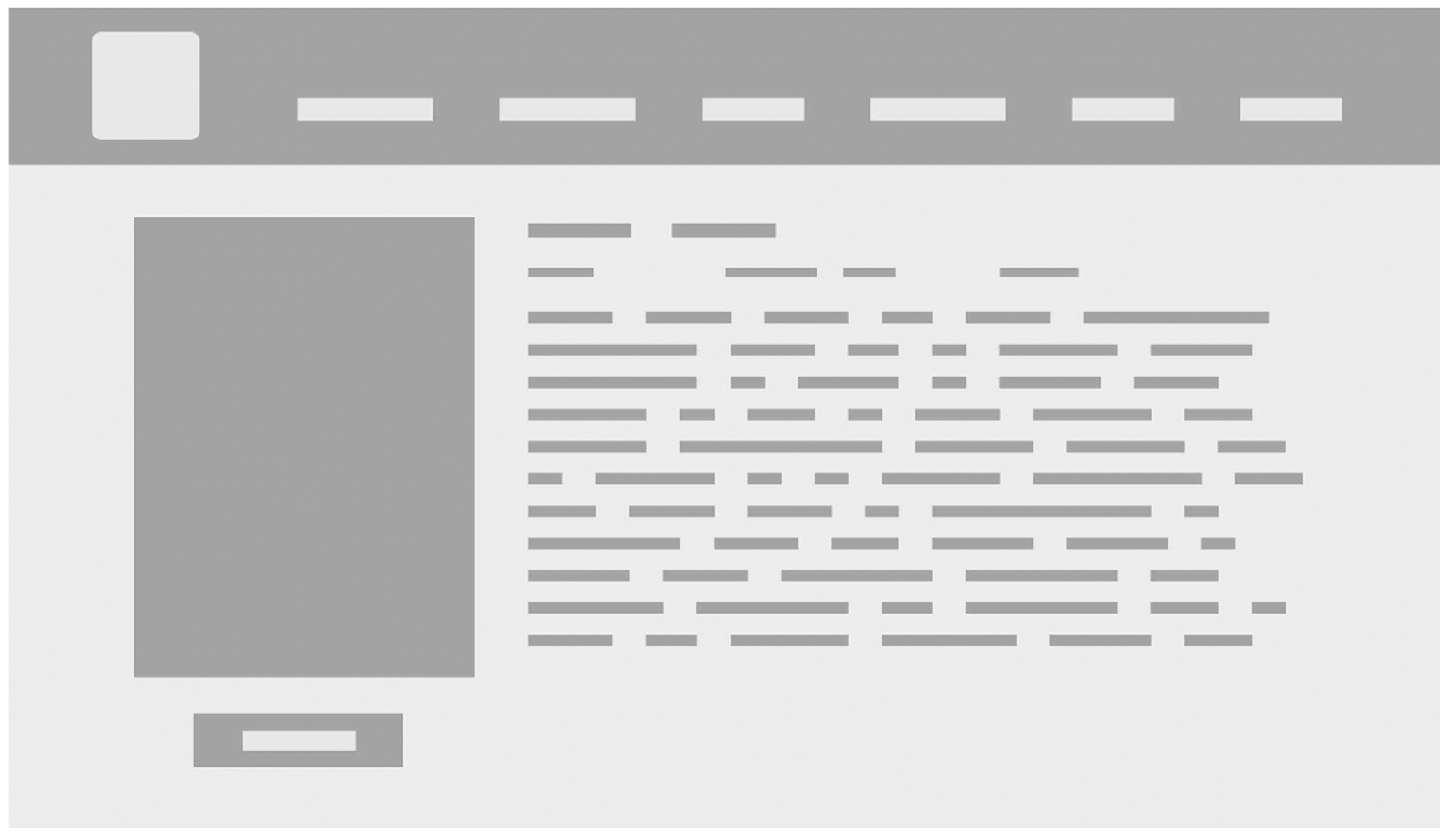
Wireframe Mid-Fi
After that initial set of boxes and copy text designations, I started fleshing out the wireframes to more accurately reflect content and buttons. Still not final design, but a clearer picture of what each specific screen required. I used as much real content here as possible while keeping things simple B&W so the client wouldn’t think of these as final UI.

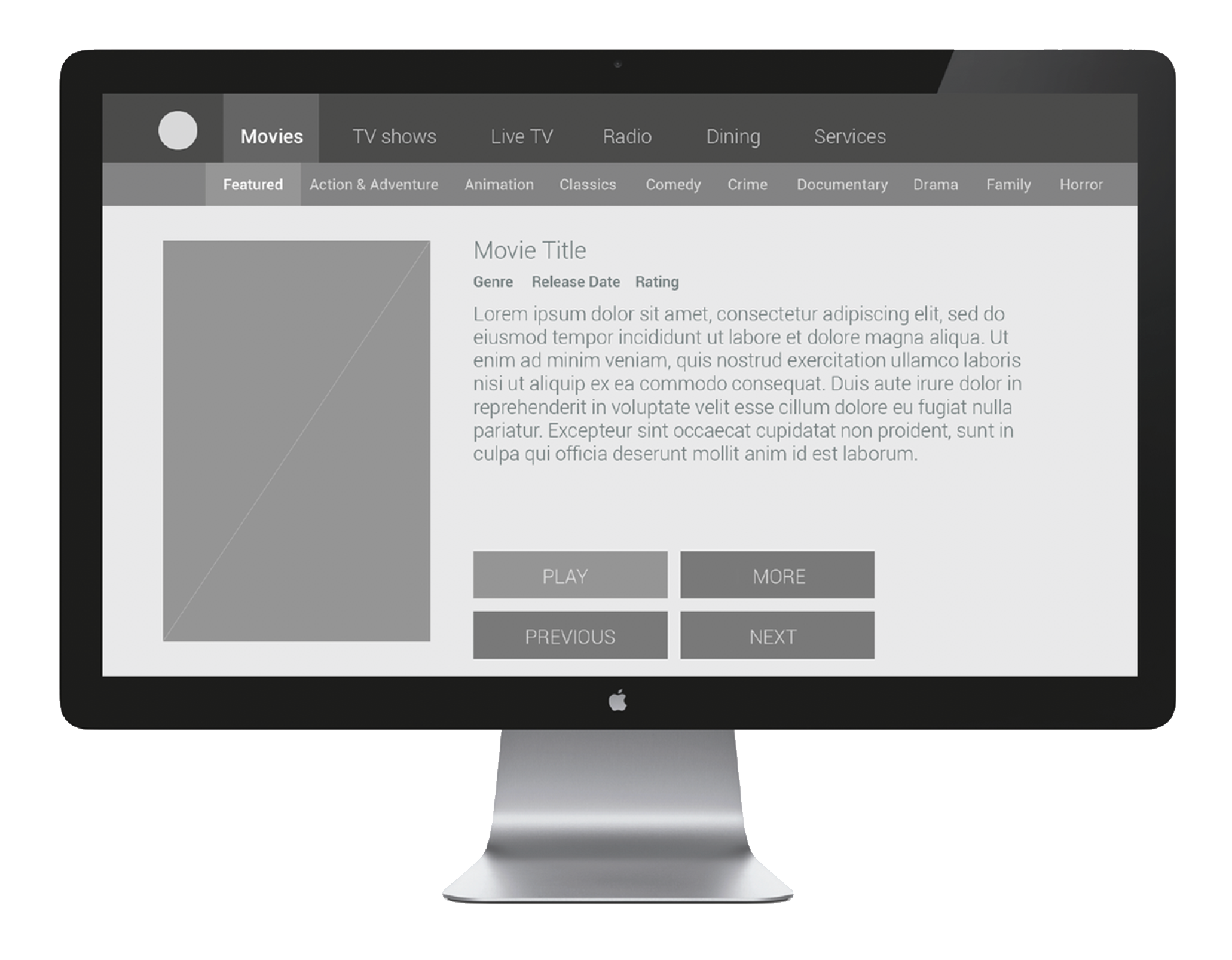
Prototypes & Testing
After all the known screens had been mocked up, I took the templates and created interactive prototypes. I wanted to re-engage with the client now to test the general happy paths and error cases. I used placeholder data but reflected what I knew was available and desired for presentation to the guests. Multiple prototypes were created to reflect the various states of a possible interaction (guest, signed-in, returning). The clients were given access to these tests for evaluation. I also shared these with our internal dev team for clearer exposure to the expected behaviors.
After collecting the feedback I put together a results presentation for review with our internal team and the clients. An interesting result was the testers had an overwhelming expectation for movie previews - which they typically find on other streaming services. Our clients didn’t have that content available but decided to add it to the system since demand was so high.
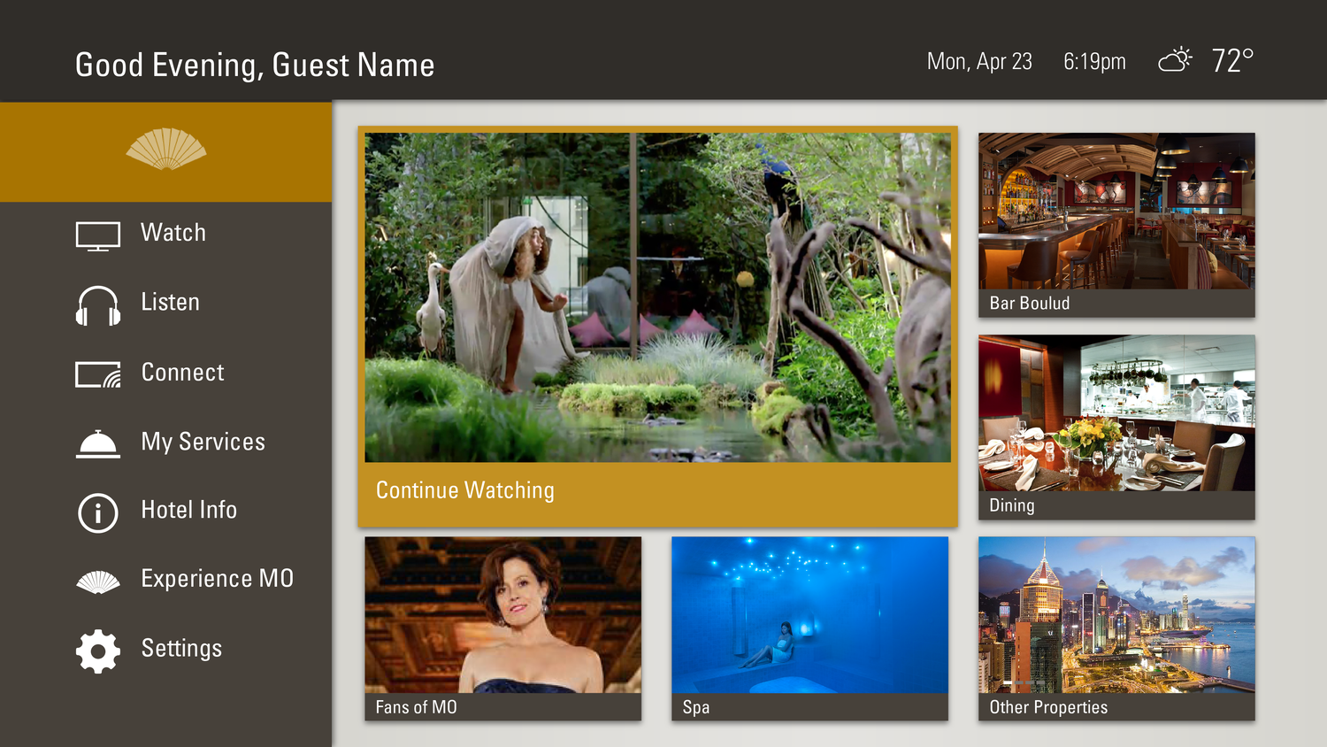
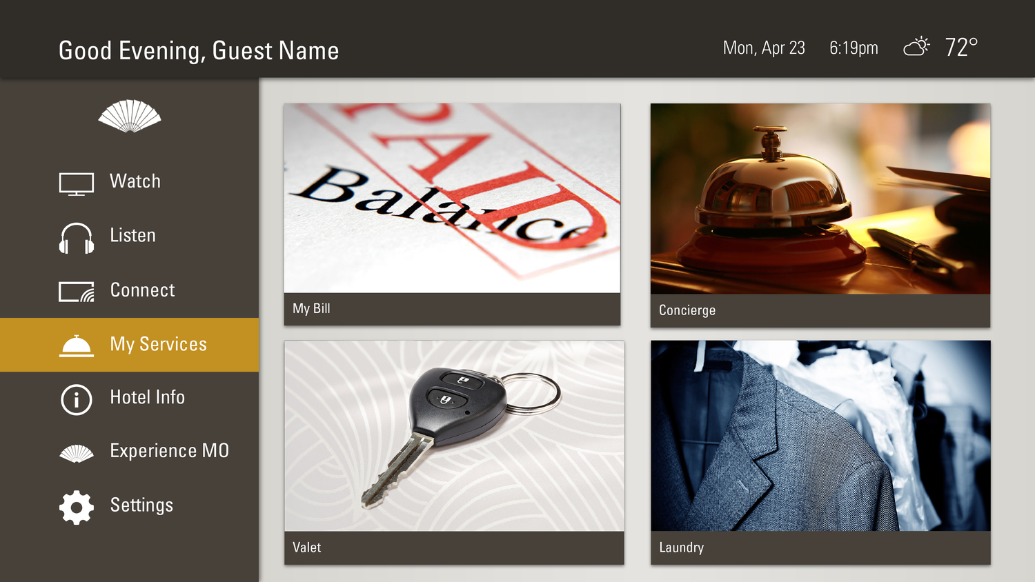
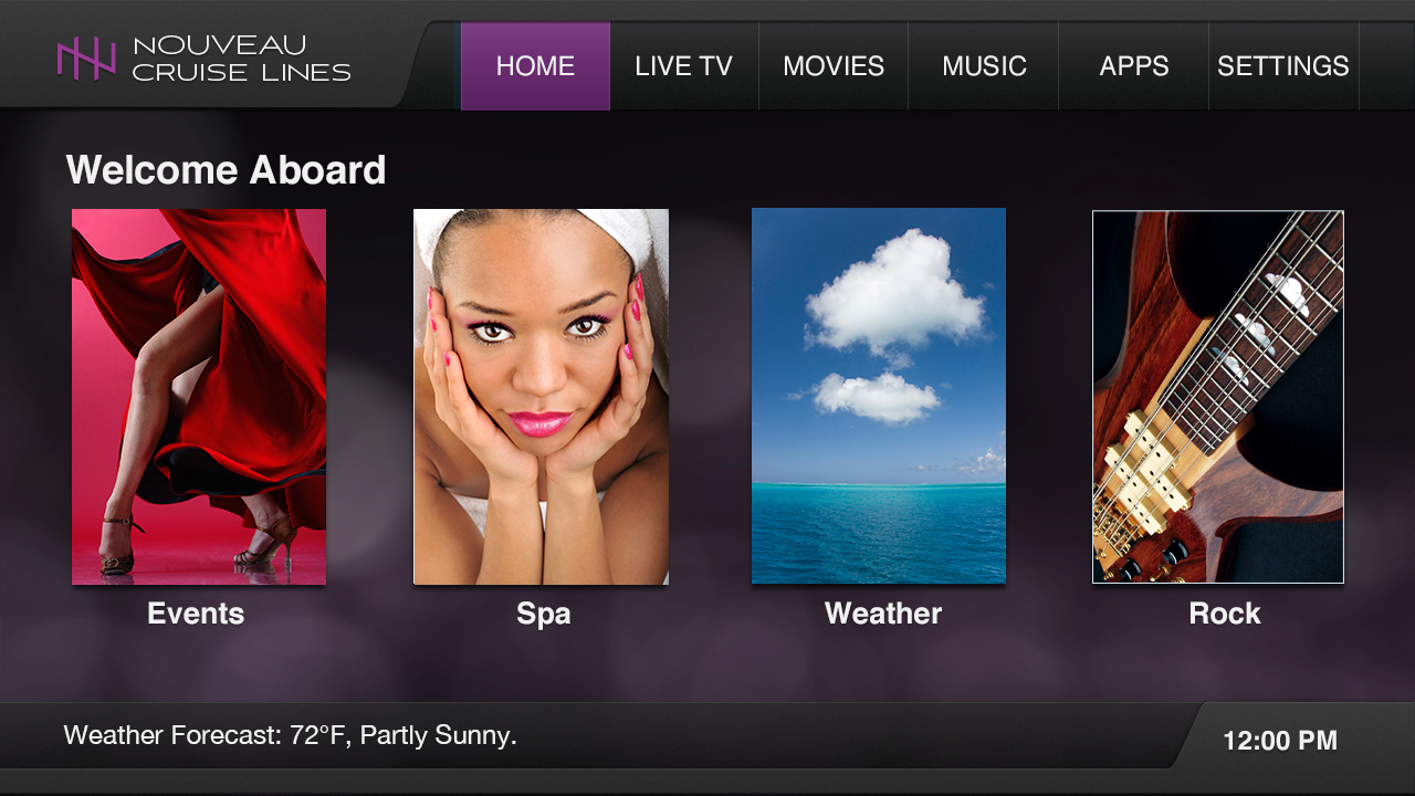
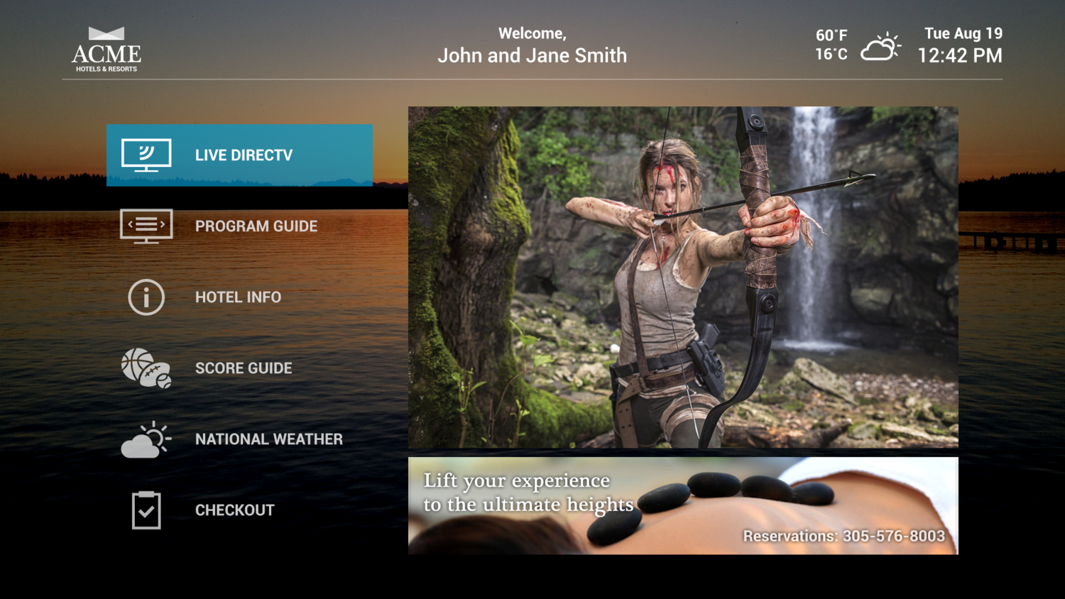
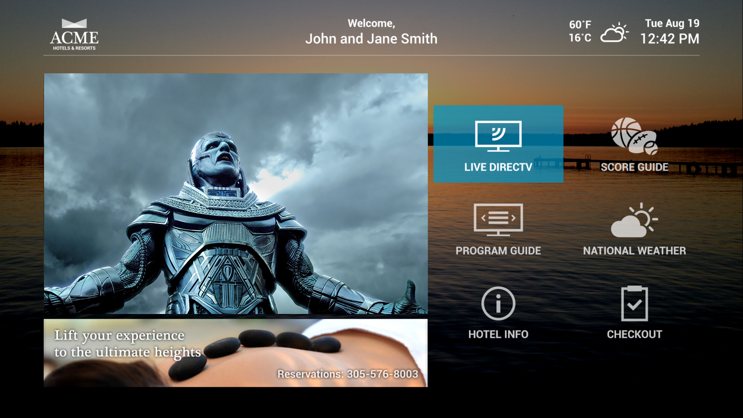
Final UI
I took the learnings from the testing and started creating the final UI. Along with intuitive functionality, I wanted to allow for customization for the various clients and display types. Elements like the backgrounds, fonts, and focus colors would be pliable based on individual clients and could be changed within our EXM content management system.

Style Guide
Because of the client ability to customize the experience, I wanted to create a style guide to help define what elements could be controlled. These elements all paired up with components within our EXM content management system. This help sheet defined what could be changed and what info was needed for input to reflect those designs.

Results
With everything finalized we set the clients loose to create their guest experiences! The customization options within the system made it incredibly expandable across the client brands, guest rooms, lounges, restaurants and shops! The results included a hugely diverse set of live TV, streaming content, specially produced brand videos, services, interactive signs and more - all displayed within a unique “brand” wrapper for each client.