General Motors Marketplace Redesign - Case Study
As part of my work at Xevo, I was tasked with updating the GM Marketplace app for the upcoming series of GM vehicle infotainment systems. We wanted a more friendly design that presented a clearer view of available features and also reduced driver distraction. This massive project required integration with multiple GM groups as well as the various merchants featured in the app and our own engineering team. This initiative is still active as more merchants are brought on board and new vehicle technologies are developed.
Adobe Creative Suite, Sketch, Omnigraffle
Lead Designer, UX/UI Design, Prototypes, Research, Strategy, Copywriting, Client Relations
Exploring the RIG
The existing system (called RIG) was reliant on outdated technology and designed with little input from UX/UI teams. It had basic functionality but not easy (or enjoyable) to use. Vehicle technology in this arena moved very slowly and was almost outdated by the time it was available to market. This was the starting point for my understanding of the available APIs and data.
Brainstorming & Whiteboarding
I reviewed the various features across multiple merchants and, along with the previous RIG documents, determined a maximum number of CTAs that would be required AND would hold up to driver distraction testing. These ideas were quickly drawn up on the whiteboard to allow discussion with the team. Upon review with the GM engineering team we also determined a set of hard-coded actions (back, close) that we could not alter so needed to be carried over to the update.
Wireframe Exploration
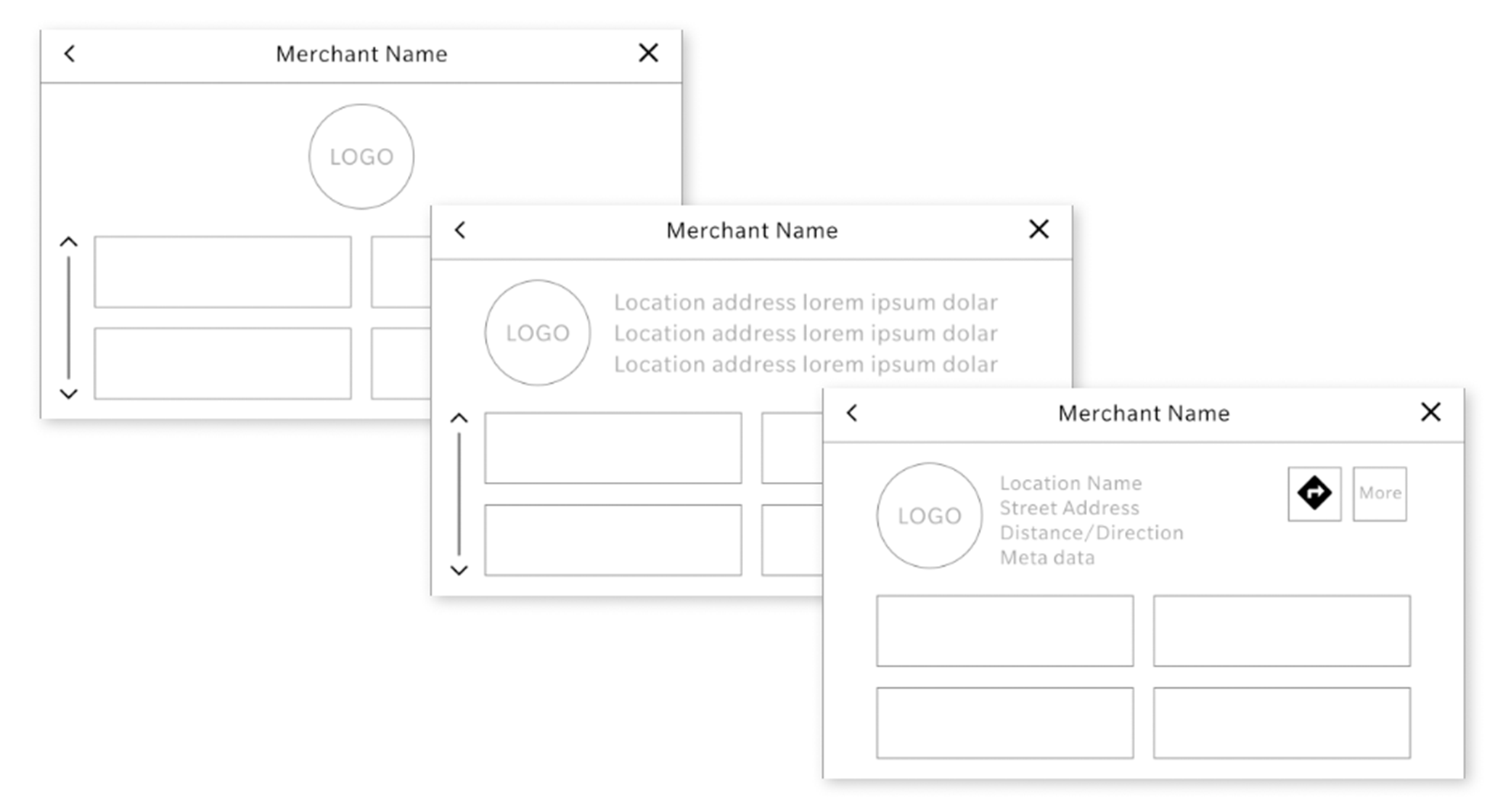
Once we had settled on the basic expected CTAs and data required for each set of merchant features to be displayed, I started working on rough wireframes. I found a few interactions that were missing from the old RIG designs (but were available in the data) and incorporated those items. Examples include showing distance, direction, and meta data (like location amenities) as well as a navigation CTA. I kept these simple so as not to have the client confuse them with final UI.
Wireframe Flows
As I designed the wireframes I also started fleshing out the different paths each merchant may require. Happy paths and more detailed, secondary and tertiary flows were included. I also recognized a set of actions that could (and should) be handled similarly across all flows so created a Global Interaction doc. Actions such as Account Set Up and Navigation would then be consistent across all merchants.
Prototypes & Testing
Once wireframes and some basic flows were worked out I began setting up user testing. I used Adobe XD for the wireframes and flows and so incorporated the prototyping tool as well. I then incorporated those prototypes into our UserTesting.com account and activated the testing. I gathered all the feedback, reviewed the videos, and put together a results presentation for review with our internal team as well as GM and the merchants. We were fortunate to have great success with this initial design and flows, so instead of iterating, we moved onto the next phase of design.
UI Exploration
For UI there are many requirements based on GM best practices as well as driver distraction regulations. I used those various documents and what we had learned from the user testing comments to created a set of screens that provided the required data in appropriate “touchable” sizes. This initial design was very basic but expanded on some points missing from the old RIG system. Along with the expanded features and more usable data layout, I introduced a few more branding opportunities with inclusion of thumbnails/icons on touchpoints.
GM and the merchants were quite happy with the update, but I wanted to keep going…
Final UI Design
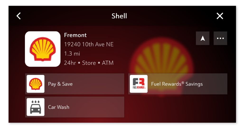
The added images and icons of the initial update were nice but left me wanting more branding/uniqueness for each merchant. After digging in a bit more with our engineering team, it was determined that we could actually include a background image along with the small thumbnails/icons. We also found APIs that had been overlooked and so added a Car Wash feature. A few other small tweaks and it was ready to be reviewed one last time by the merchants and GM folks. With their happy approval, we had the driver distraction team review the results and got full approval for deployment into vehicles!
Results
The feedback from drivers and merchants was so positive that GM decided to use this basic design pattern across a variety of their brands! Awesome news… so back to the design table to adapt these for all the diverse (and sometimes bizarre) new infotainment screens! Unfortunately these screens are so outdated now… a sad effect of the out-to-market delay of the auto industry.


