Experience Manager (EXM) - Case Study
Experience Manager (EXM) is a highly successful CMS for sharing content across a wide range of screen types. It’s used by major clients like Disney, Carnival Cruises, DirecTV, and others featured in my portfolio. However, its origins were far more primitive, as it was originally designed to be managed solely by a back-end developer. My challenge was to preserve the product’s data-rich environment while simplifying interactions so the system could be easily used by anyone, regardless of technical background. The end product ultimately resulted in a 90% increase in user satisfaction ratings!
Adobe Creative Suite, Sketch, Omnigraffle
Lead Designer, UX/UI Design, Prototypes, Research, Strategy, Copywriting, Client Relations

PROCESS OVERVIEW
The general process I like to follow is the Double Diamond: <Discover, Define>< Develop, Deliver>. While there are loops and cycles within each phase, I appreciate the clear forward momentum this approach provides. The stages outlined below are applied to each project, though not always in the same order. For example, I often create early low-fi prototypes to help development teams validate data and APIs.
-
What are the business goals and what does success look like?
Who are the users and what is the challenge?
What are technical, resource, and budget constraints?
-
Study the users in the expected environment to align with the context of use.
Ask broad, open-ended questions to encourage detailed, unbiased responses.
Be aware of emotions as well as actions.
-
Evaluate, interpret, and prioritize findings.
Define clear requirements based on insights.
Develop user stories, user journeys, and other supporting documentation as needed.
-
• Information architecture
• Low-fidelity feature flows
• High-fidelity compositions
• Comprehensive design system
• High-fidelity feature flows
-
Concepts developed as interactive prototypes with InVision and Figma, covering everything from individual interaction examples to full feature flows.
-
Test continuously throughout the process. Once we have solid validation, full feature prototypes move to the development team. Usable test builds are then released to a limited group of customers, allowing us to gather analytics and feedback as final production moves forward.
The Original Solution
EXM was originally created as a quick CMS to help fill screens in a few hotel guest rooms at a specific location. The initial solution was clearly not designed for the average back-of-house employee. Using the system required a high degree of programming knowledge and strong typing skills, as most of the interaction relied on manual data entry. While it worked well when managed and updated by our internal team, it did not scale easily for additional locations or hand-offs. However, the CMS proved popular enough that we recognized the potential to create a more user-friendly version to be licensed to a broader audience.

Initial Clean-Up
My first stab at an update was to remove any need for use of a programing language. I wanted this to function in a more recognizable way… like setting up an account profile or payment method on a website. I jumped straight in and started creating content/data categories and grids. The intent was to have minimal data entry and maximize autofill and drop-down menus. Once I had a base set of templates, I met with the dev team to discuss feasibility of building the backend to support this direction. I created a large number of layouts to accommodate the various needs and worked with the team to get these made into a low fidelity but functioning prototype. We but this system out to test with a couple local clients to verify ease of use, speed, and API stability. Once we felt satisfied with the results, we moved on to full production.

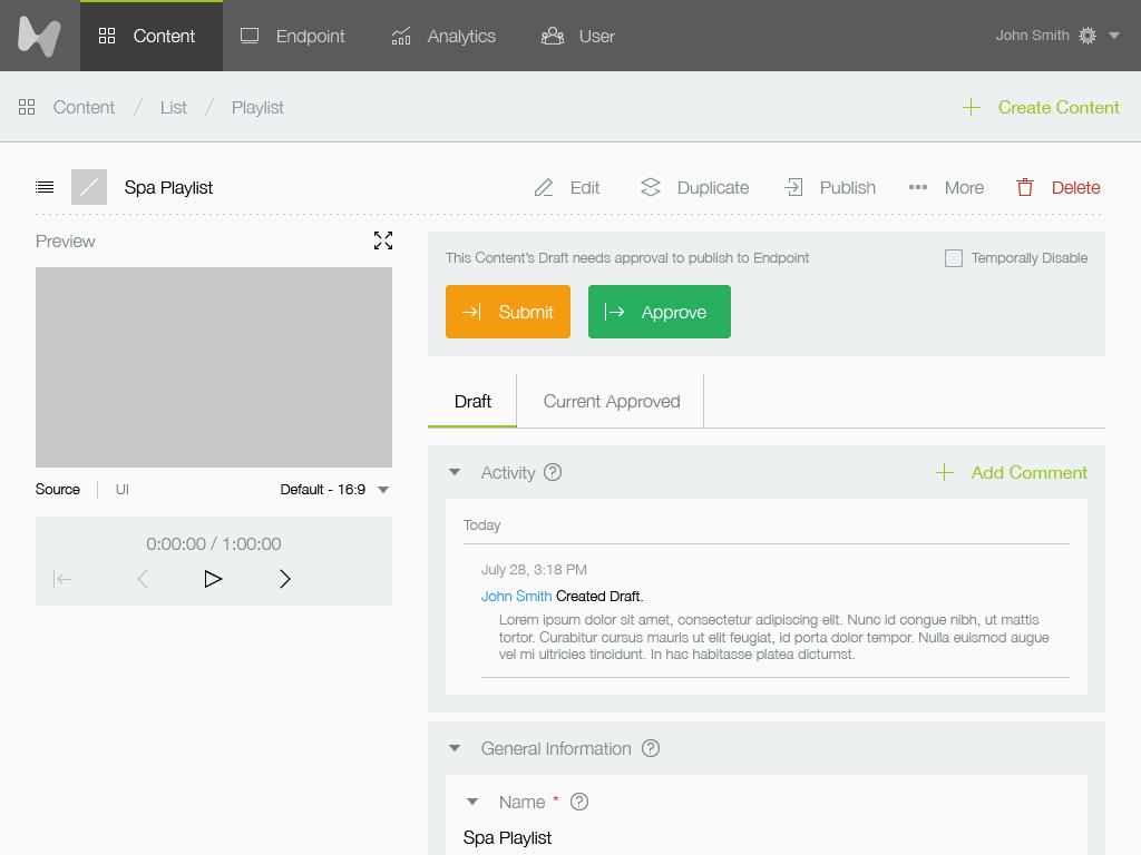
UX/UI Refinements
Once we had a functioning system in place, I developed a clean UI along with a set of components, functionality rules, and a style guide. Big chunky buttons and segmented content seemed fitting to help direct the users across the still complicated processes. Along the way we found functionality improvements like collapsing content and adding guidance links next to most features.

Information Architecture
We originally kicked off the project with a LOT of whiteboard flowcharts and sticky note shifting to quickly map ideas and explore different paths. It was a fun, messy way to get all the possibilities out in the open. As things started to take shape, I moved into a more formalized structure with cleaner, organized diagrams and data flow maps to bring some order to the chaos. As features, endpoints, and APIs expanded throughout the project, I continually updated the flow documentation to keep the team aligned and ensure everything stayed connected. It became our go-to reference to avoid missteps and keep momentum.

Improvements
After many weeks of testing the system with clients we found a need for further improvements. I determined using pop-overs would be more efficient as a replacement for drop-down menus when selecting certain data. I thought it would help keep the user directed in specific tasks and allow another layer of depth within the controls without confusing the process. We did a quick user test and found that the users 100% agreed with this method - so we updated the builds with the new components. Testing and feedback continued and other changes were made to advance the UX experience.

Design Library
This snapshot shows a collection of atoms, molecules, and organisms from our front-end component library, managed in close collaboration with the development team. Creating this library helped ensure consistent design quality while reducing development time by 20%. We also created and managed our own icon font library, with approved updates pushed into GitHub, saving a tremendous amount of development effort over time. It gave us a lot more control over our visuals and let us move faster without relying on third-party icon sets. Plus, it made it easier for devs to plug things in without hunting for missing pieces.

Sustainment & Growth
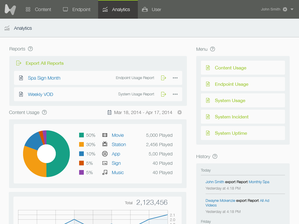
The appeal of EXM expanded our client base both in individual locations as well as new verticals. The original goal as a CMS for in-room TV programming branched off into new territories like digital signage, analytics, live TV access, ordering services, and profile management. This expansion required a massive quantity of new UX. I designed hundreds of different templates, components, screens, and UX flows to accommodate all the new requirements. Each new use case brought its own quirks and challenges, which kept things interesting and pushed us to think creatively.

Results
The final product is an incredibly powerful and easy to use CMS that expanded far beyond our original intent. It is built in such a way that it can easily be expanded both in UX and UI to accommodate managing an almost infinite number of content types and data.